
A way to think about web layout built on one fact about how the human eye sees, and on one fact about where it looks first, and how those two facts shape the way my team and I build websites.
A while back I started reading about central and peripheral vision and how they divide the work of taking in a page. The science describes how vision works. The way I apply it to layout is my own interpretation, drawn from the sites we’ve built and watched perform, and I’ll mark the line between the two as I go. Web design is a field full of competing models and conventions, and every so often it pays to go back to first principles, to how people physically see, and check the layout decisions against that.
The models we already use: Z- and F-patterns
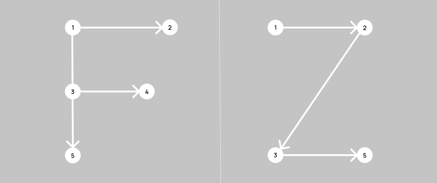
There are two widely accepted models for how a user’s eyes scan a web page: the Z-pattern and the F-pattern. Both are useful, and you’ve seen them referenced; the F-pattern goes back to early eye-tracking work popularized by the Nielsen Norman Group. In 2017 NN/g revisited its own finding and added the patterns the F had been hiding: the layer cake, where the eye samples headings and skips the body; the spotted pattern, where it hunts for one thing; bypassing, where it skips lines that all begin the same way. So the people who gave us the F already treat it as one pattern among several. What I want to describe sits next to all of them. They describe how the eye travels. This is about how much it sees at each stop, and where the first stop is.
How little the eye sees at once
Our eyes don’t see a scene evenly. They lock onto a single point, and everything around it falls off into blur. We see in full sharpness and colour only what the eye is fixed on at that moment. Central vision is what we use for reading, recognizing faces, driving, and it covers a startlingly small slice of the field of view. The fovea, the dense patch of cones at the centre of the retina, is usually described as the central 1.5 to 2 degrees of vision. For someone sitting at a monitor that’s a circle about 2 cm across on the screen, roughly a thumbnail held at arm’s length.
That tiny patch does most of the work. The macula, the broader central region, makes up only about 4% of the retina and 10% of the visual field, yet it carries the majority of useful daytime vision. Acuity drops by roughly half within the first two or three degrees away from the point of fixation and keeps falling from there, so a sliver of your sight is doing nearly all the seeing.
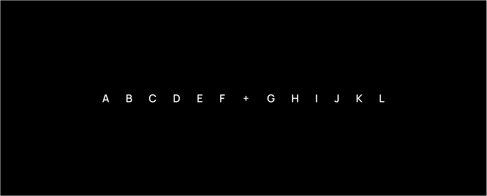
This works best on a monitor or any high-resolution screen. Focus on the plus sign (+) in the very centre of the row of letters. Looking only at it, you’ll be able to make out the “F” and “G” right beside it, maybe “E” and “H” too. The rest will blur, or you won’t see them at all.
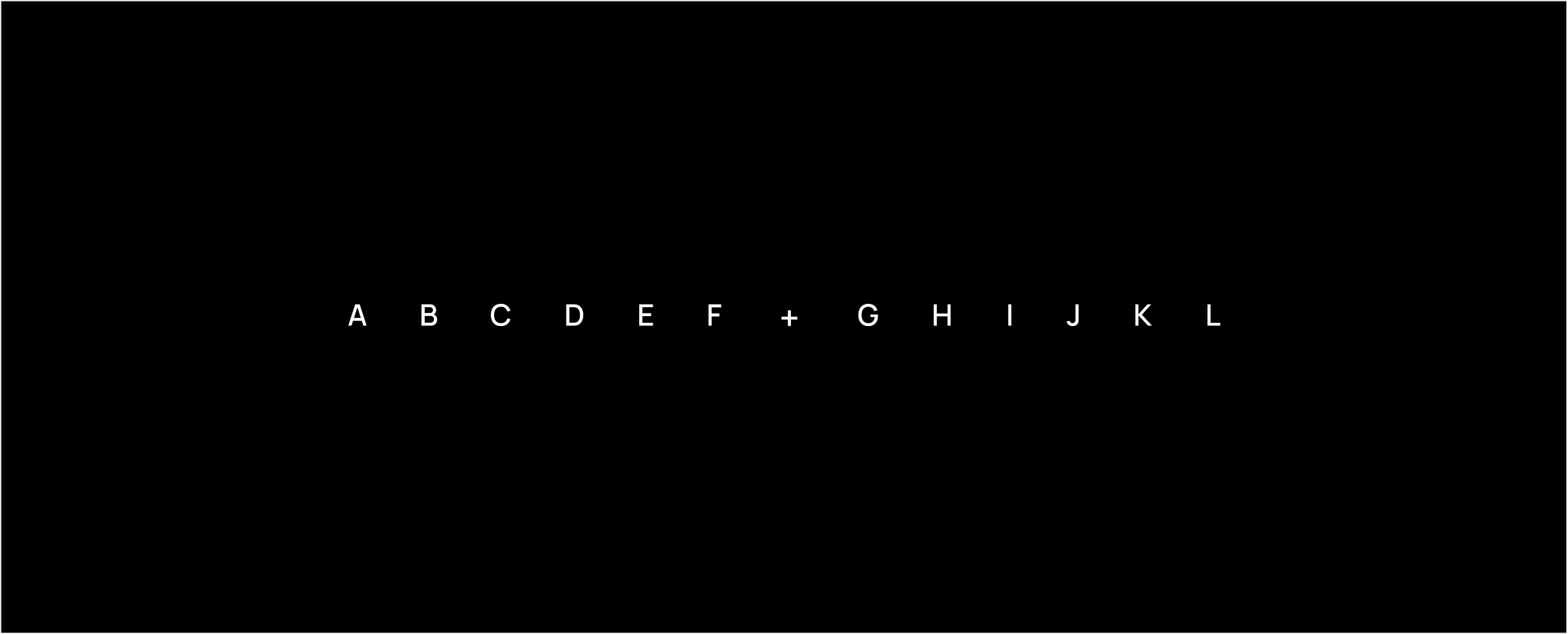
The same test with larger type. The outer letters stay just as hard to read; making everything bigger doesn’t help.
Only in this last version, where the outer letters are twice the size of the central ones, can you read them while your eye stays fixed on the centre.
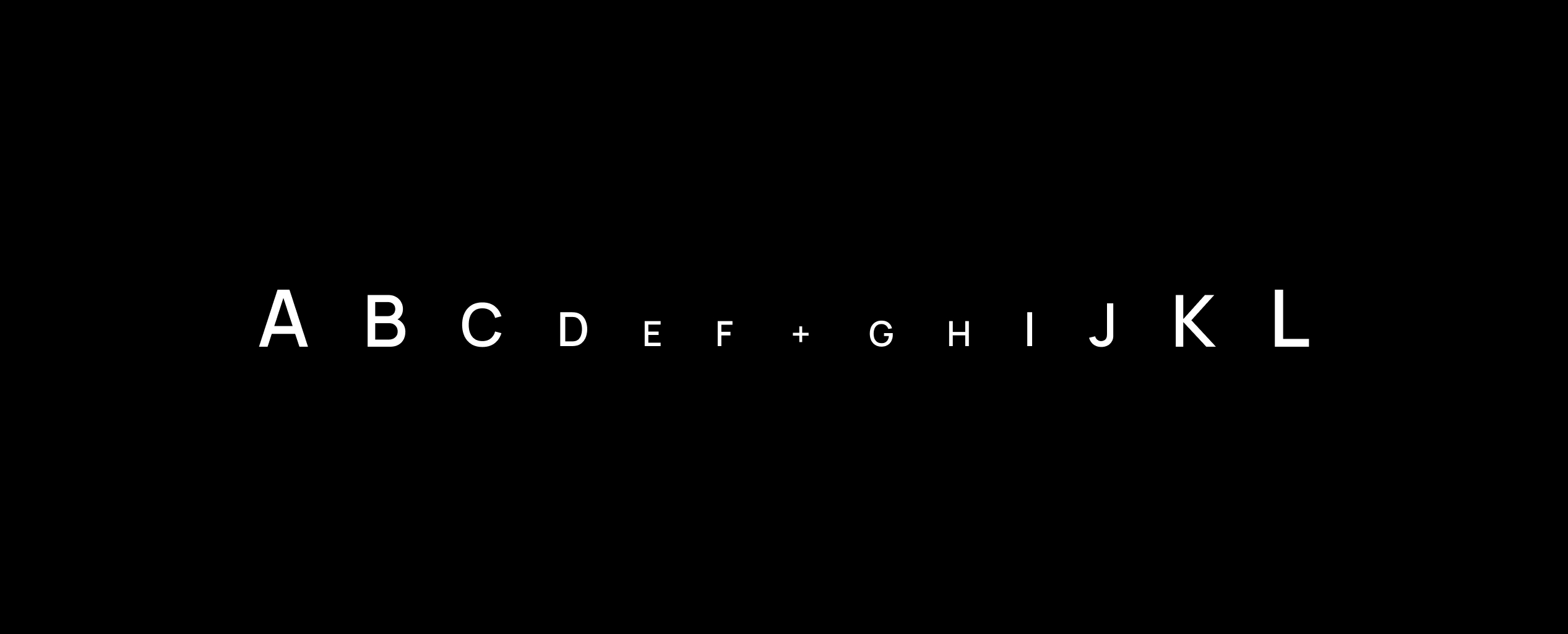
Two caveats on the demo, in the interest of honesty. First, these images are deliberately high-contrast, black background and white letters, so every letter is as legible as it can be; a real page is worse. Second, there’s an effect that makes the third image work which isn’t only size. It’s called crowding: a letter a few degrees off-centre is easy to read on its own and becomes nearly unreadable the moment it’s flanked by other letters and objects. The rule of thumb is Bouma’s: an object at a given distance from the fixation point stays readable only if its neighbours are further from it than about half that distance. When I doubled the outer letters I also doubled the gaps between them, and that spacing is doing some of the lifting. It’s also a layout rule in its own right: the further from the focus something sits, the more air it needs around it to be seen at all. On a dense, low-contrast page the periphery is worse off than this clean demo suggests. The blur is interference as much as softness.
“But the eye moves”
The first thing a careful reader will raise. The fovea is tiny, but the eye doesn’t sit still. It makes several rapid jumps (saccades) a second, and over a few seconds it can tour the whole page. Why should any one region matter if the eye will get everywhere eventually?
Because of where it goes first, and how fast the verdict comes. Each fixation lasts roughly 200 to 400 milliseconds, and detail registers only during the fixation, only where the eye has landed. Where it lands first is not random. Eye-tracking work on scene viewing (Tatler, 2007, in the Journal of Vision, and a run of studies since) found a strong central bias: on first exposure to a new image or screen, people fixate near its geometric centre, largely regardless of what’s drawn there. The first two or three hundred milliseconds on a page go to the middle of the screen before the content has had a chance to pull the eye anywhere. And the verdict arrives inside that window. A well-known Carleton University study found that people form a judgment about a page’s visual appeal in about 50 milliseconds, faster than a blink, and later work from the same group found the judgment holds at exposures shorter still.
What the periphery is for
This is where my thinking changed while writing. I used to treat peripheral vision as the part of the screen that can afford to be skipped. Half right. The periphery reads badly, but it’s sensitive to exactly the things that pull a saccade: contrast, size, motion, and faces, which the visual system picks up far off-centre. Peripheral vision is how the eye decides where to jump next. It’s the steering, and it can be steered.
So the page has two tiers, and they have different jobs. Whatever has to be read, understood or acted on belongs inside the focus, where the eye is or where it’s about to be. Whatever sits outside it is either empty, or it’s there to move the eye on purpose: a face turned toward the headline, one high-contrast block, the single control you want them to reach next. Anything else in the periphery is noise that competes for the next jump. A logo in the corner is harmless because it’s small and low-contrast. An animated widget in the corner steals the saccade every few seconds and is the most expensive thing on the page.
How wide the band is, and why it needn’t be centred
Reading research gives the width. When we read, each fixation takes in about fifteen characters to the right of the fixation point and three or four to the left, so a line gets covered in a handful of jumps, and at the end of each line the eye has to sweep back to the start of the next. On long lines that return sweep misses, and the reader re-reads or loses the line; that’s why typographers have settled on 45 to 75 characters as the comfortable measure and why a paragraph stretched across a full 1,600-pixel desktop is exhausting even in a good typeface. A column of text is a band about as wide as three or four fixations. That’s the unit.
The band’s position is a separate choice. First fixation favours the centre, but the centre bias is a starting point, not a cage: once the periphery has something to steer toward, the eye follows. On our own homepage the band sits right of centre, and the left third of the screen is empty on purpose. Empty isn’t wasted. It means there’s nothing on the left for the periphery to jump to, so the first saccade out of the centre has one destination.
An e-commerce layout we designed does the opposite. The band is on the left, and it opens with a face, which the periphery catches before anything else on the screen. The right column, the seasonal banner and the gift-card block, is peripheral by design: readable once the eye chooses to go there, and built from large, low-detail shapes that survive being seen out of focus.

The rule we follow
One band per viewport, three or four fixations wide, placed where the eye lands or where one clean cue sends it. That is the layout rule under our digital experience design work, and it decides the wireframe before any visual style does. Inside the band, in the order a visitor needs them: what this is, why it’s for them, the evidence, the next step. A short video where it earns its place, since motion in the band holds a fixation rather than stealing one. Outside the band: air, or one deliberate cue. On a page that sells, the offer and the call to action sit in the band; a banner placed in the margin is invisible for the reasons above, well before banner blindness gets a chance to apply.
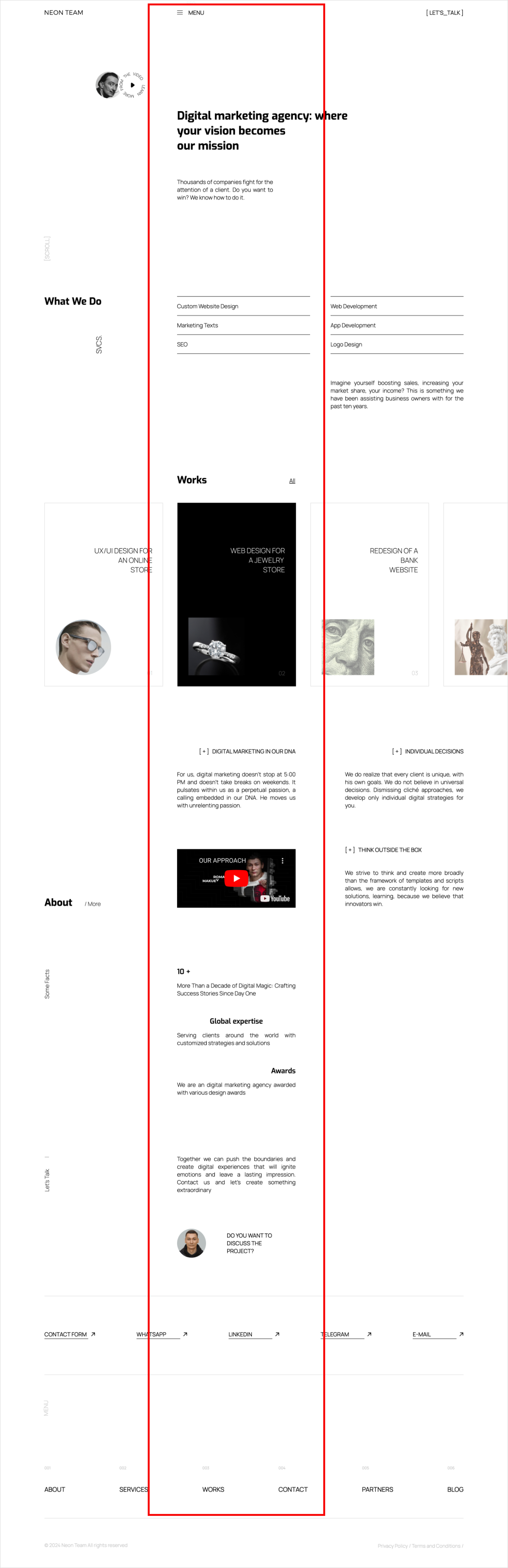
This sits alongside the Z- and F-patterns rather than replacing them. They describe the route. The band describes what’s legible at each stop on it, and the two tiers describe what should be pulling the eye between stops. Used together they explain something the scan paths alone don’t: why a split hero, headline on the left and image on the right, tends to underperform a stacked one — the pattern I flag most often in a B2B redesign. It divides the first fixation between two targets, and neither gets the 300 milliseconds.
What I don’t know yet
Two things. The first is mobile. A phone held at 30 cm spans about 13 degrees of vision and the fovea covers about a centimetre of it, so the whole screen is already a single band; the question there is vertical order and what sits above the fold, and the argument in this article mostly stops applying. The second is that I don’t have a controlled test of my own. The rule comes from watching our sites perform and from the vision research; it doesn’t yet come from an A/B run under my name. The one I’d run first is the split hero against the stacked hero on the same page, same copy, same image, measuring time to first click and conversion. If the band model is right, the stacked version wins by a margin you can see. If it doesn’t, I’ll say so here.
Until then, the working claim: the layouts that convert best over the next few years will be the ones that treat the first fixation as the scarce resource, one band, one cue, and nothing else asking for the eye.