Designing Websites Around Human Central Vision I want to share some peculiar regularity and, in my view, a new approach to web design.
A new way to think about web layout — built on a simple fact about how the human eye actually sees.
Hey, my name is Roman Makuev. I’m a UX/UI designer and the CEO of Neon Team, and in this article I want to share how one simple fact about human vision shapes the way my team and I build websites.
A while back I started reading about how central and peripheral vision shape the way people take in information. What I found is simple, but it’s easy to overlook — and it has a real effect on how a page should be laid out. Let me be clear about one thing up front: the science describes how human vision works. The way I apply it to web design is my own interpretation, drawn from experience. The facts are borrowed; the conclusions are mine.
Web design is a field full of competing models and conventions. But every so often it’s worth going back to first principles — to how people physically see — and checking our layout decisions against that.
There are two widely accepted models for how a user’s eyes scan a web page: the Z-pattern and the F-pattern. Both are well known, both are useful, and you’ve almost certainly seen them referenced — the F-pattern in particular goes back to early eye-tracking work popularized by the Nielsen Norman Group. I’m not going to lean on them here. I mention them because everyone in design knows them, and because what I want to talk about sits next to them rather than replacing them.

Our eyes don’t see a scene evenly. They lock onto a single point, and everything around it falls off into blur. The further something sits from that point of focus, the less detail we get. We only truly see — in full sharpness and color — whatever the eye is fixed on at that moment.
Central vision is what we use for reading, recognizing faces, scanning images, driving. But it covers a startlingly small slice of our field of view. The fovea — the dense patch of cones at the center of the retina — is usually described as the central 1.5 to 2 degrees of vision. For someone sitting at a monitor, that’s a circle only about 2.5 cm across on screen — roughly the size of your thumbnail held at arm’s length (Breck-McKye, Human Vision for UI Designers). Everything outside that is peripheral: good at catching motion and rough shape, poor at detail.
Here’s the part worth sitting with. That tiny central patch does most of the work. The macula — the broader central region — makes up only about 4% of the retina and 10% of the visual field, yet it carries the majority of useful daytime vision. A sliver of your sight is doing nearly all the seeing.
One way designers have put it: foveal vision is extremely high resolution — arguably sharper than a 4K screen — while everything in the periphery drops off so fast it’s closer to an 8-bit display. 4K in the center, 8-bit at the edges. That’s the eye you’re designing for.
Try this yourself
This works best on a monitor or any high-resolution screen.
Focus on the plus sign (+) in the very center of the row of letters. Looking only at it, you’ll be able to make out the “F” and “G” right beside it — maybe “E” and “H” too. The rest will blur, or you won’t see them at all.
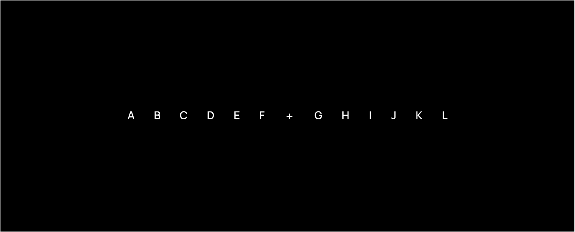
Here’s the same test with larger type. Even now, the outer letters stay just as hard to read — making them bigger across the board doesn’t fix it.

And only in this last version — where the outer letters are literally twice the size of the central ones — can you finally read them while your eye stays fixed on the center.
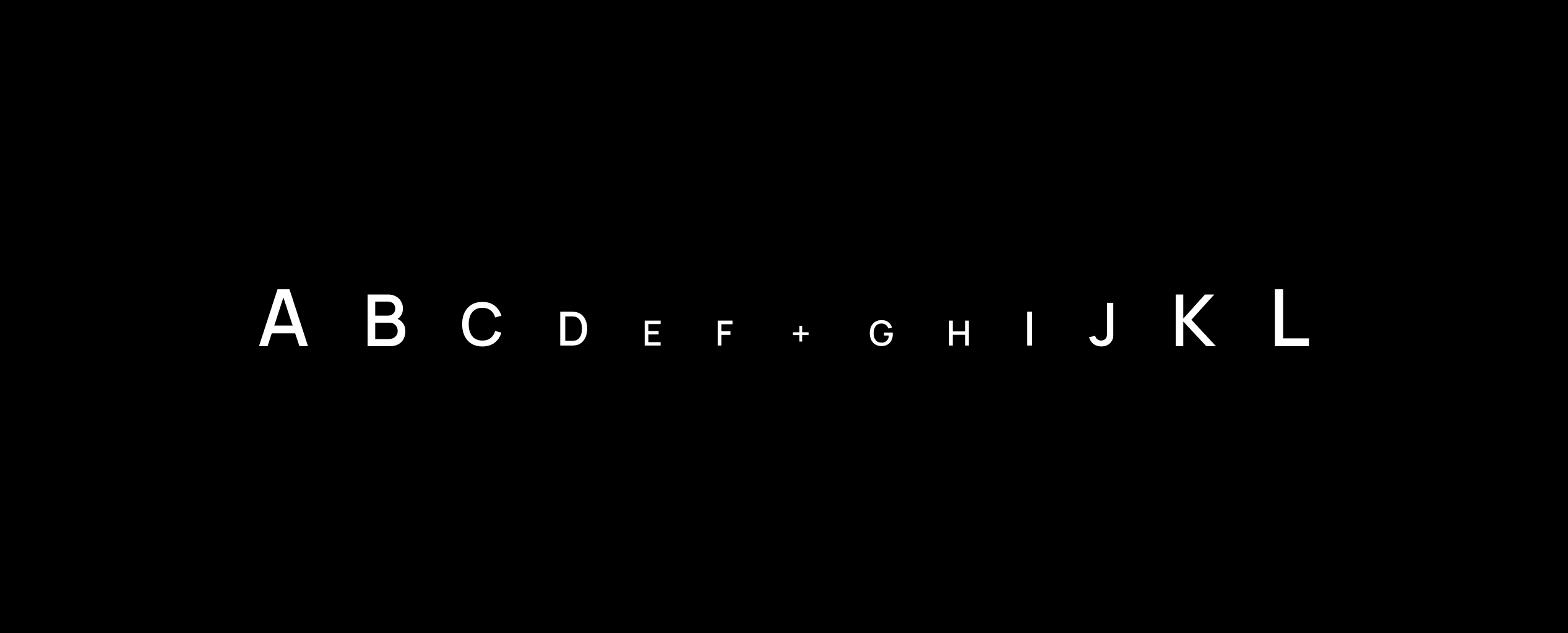
The takeaway is simple: if information sits far enough from the center, it effectively doesn’t exist for the brain until the eye moves to it. In a world drowning in content, it’s wishful thinking to expect a visitor to carefully study every part of a page.
It’s worth noting these test images are deliberately high-contrast — black background, white letters — so every letter is as legible as it possibly can be. There’s also a second effect making real layouts harder than this test. It’s called crowding: a letter sitting a few degrees off-center is easy to read in isolation, but becomes nearly unreadable the moment it’s flanked by other letters and objects. On a real screen — dense layouts, lower contrast, things packed together — the periphery is even worse off than this clean demo suggests. The blur isn’t just softness; it’s interference.
The Z- and F-patterns are useful, but in my view they leave out several things that matter just as much today:
There’s a fair counter-argument I want to address head-on, because it’s the first thing a careful reader will raise. The fovea is tiny, yes — but the eye doesn’t sit still. We make several rapid jumps (saccades) per second, and over a few seconds a person can scan the whole page. So why does the center matter if they’ll eventually look everywhere?
Three reasons. First, each fixation is brief — roughly 200 to 400 milliseconds — and detail only registers during that fixation, only where the eye lands. Second, crowding means dense peripheral content stays hard to parse even after a glance. And third, the decision often happens before the full scan does.
That third point is the strongest. A well-known Carleton University study found that people form a judgment about a page’s visual appeal in about 50 milliseconds — faster than a blink, and faster than the eye can tour the layout. So I’m not claiming the periphery is invisible. I’m claiming that in the decisive first moments, and inside dense real-world layouts, the center wins. That’s where the bet should sit.
A single eye fixation lasts roughly 200–400 milliseconds — just enough for the brain to register what it’s looking at. Since detail only lands where the eye is focused, the practical conclusion is straightforward: the elements that carry the most weight belong on the path of the gaze, not pushed out to the margins where vision is poor.
This isn’t a replacement for the Z- and F-patterns — it’s a different question. Those describe how the eye moves across a layout. This is about where vision is actually sharp at any given moment. Used together, the rule I follow is simple: the elements that answer a visitor’s questions, ease their doubts, and move them toward a decision should stay in focus rather than drift into the blur. In my experience that makes a page easier to read, easier to trust, and more effective at its job.
This approach shapes a few consistent choices in how we build sites:
There’s some empirical support for the aesthetic side, though I’d treat it as suggestive rather than proven, and I lean mainly on experience. One often-cited A/B test is worth mentioning: removing the navigation bar from a landing page — stripping away everything competing with the single call-to-action — reportedly doubled signups, from 3% to 6%, for the retailer Yuppiechef. Fewer things fighting for the focal point, more of them acting. That’s the principle in one experiment.
So two principles meet: what we know about central vision, and what we know about visual aesthetics.
For the elements that most influence conversion — the ones placed along the natural path of the gaze, in the central band of the page — we focus on:

Here’s how that plays out on a real project. On this legal-services site, the red band marks the central zone of focus — and everything that has to do the persuading sits inside it: the headline, the offer, the video, the core services, the call to action. The edges carry secondary information that can afford to be skimmed or skipped.
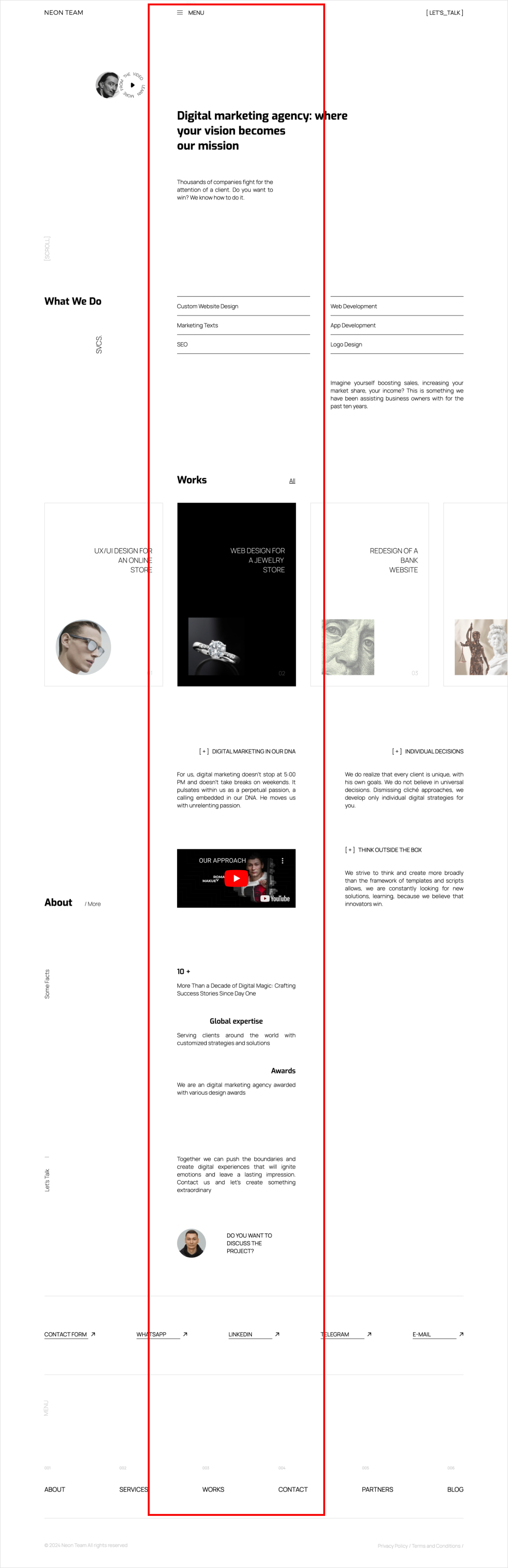
The same logic on our own site. The central band holds the message, the work, the proof, and the contact step; supporting detail lives in the margins. Same principle, different content.
Why this approach is worth considering
The web is overloaded with content, ads, and distraction. Cutting through that and holding a target audience’s attention is genuinely hard, and competition only grows — hundreds of companies pouring budget into the attention of the same first potential client.
That’s exactly why placement matters. If you only have a few hundred milliseconds of someone’s focused attention — and a first impression that forms in fifty — the worst thing you can do is spend it on decoration while your real message sits in the blur. The principle is old and simple: put what matters most where people are actually looking. It’s easy to state and easy to forget. In my experience, applying it consistently is what turns a page from something people glance at into something they actually read, and act on.



