Most B2B redesigns make the site prettier and the pipeline worse. 14 years of cleaning up that exact mess, written down.
A company decides the site looks old. They bring in a studio, get something cleaner, launch it, feel good about it for a week. Then the demo requests don’t move. Sometimes they drop. A month and a half later somebody finally opens Search Console and notices half the old rankings are just gone, and nobody in the room can tell you why.
I’ve been called in to fix that exact mess more times than I want to count.
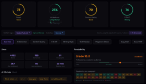
I’m Roman Makuev. I run SEO and design at Neon Team — fourteen years of this, across the US, Russia and Asia. At some point I got sick of arguing about SEO from memory and built my own analysis tool, Algorithm, so the work was measurable instead of a matter of opinion. Most of what follows comes from autopsies on redesigns that died the way I just described.
One idea before the rest of it: a B2B redesign almost never fails on the design. It fails because a designer, an SEO and a copywriter each did good work in separate rooms and never once agreed on a plan. The studio made it pretty. Nobody made it findable. Nobody made it argue. You can have all three and still lose if they’re not the same conversation.
The deep technical layer — semantic core, architecture, Core Web Vitals numbers, schema — lives in a separate piece I wrote, SEO Starts Before the First Line of Code. I’ll send you there instead of repeating it. This one is about the redesign itself: what’s different when you already have a site, traffic, and rankings you can’t afford to set on fire.
TL;DR
- Two failure modes: the right people never find the site, or they find it and leave. Same root — it wasn’t built around a real buyer.
- “Prettier” isn’t a strategy. First impressions are 94% design and form in ~50ms, but a clean look that ignores buyer psychology still won’t convert.
- Migration is where the traffic bleeds out. Everyone repeats “set up 301s.” Almost nobody warns you about the rankings you lose deleting pages, breaking internal links, or rewriting titles that already worked.
- Don’t just copy the competitors. Cover the intents and segments they missed, so every page answers one question.
- Don’t rewrite the whole blog for “topical authority.” In 2026 that’s how you earn a domain-wide penalty. Ship 5–10 pieces with real cases instead.
- Sometimes the honest call is: don’t redesign yet. If the math doesn’t close, design doesn’t fix it.
Every weak B2B site I’ve audited has one of two problems. Worth naming which one is actually yours before you spend a dollar on design.
One: the right people never see it. The buyers at the accounts you want are out there searching — Google, and more and more ChatGPT, Perplexity, the AI Overviews — and you’re not in the answer. That’s not a design problem. It’s not an ad budget problem either, whatever someone’s trying to sell you. The site was never built to be found by people asking specific questions.
Two: they see it and leave. Traffic’s fine. Demos aren’t. People land, glance around, hit back. This is the one everybody reaches for a redesign to fix — new hero, shorter form, cleaner homepage — and it’s the one a redesign fixes least reliably, because the problem usually isn’t visual.
Both come from the same place. A site that wasn’t built around an honest picture of the buyer — who they are, what they type into the box, what makes them trust you — fails on both fronts at once. It won’t show up when they look. And when it does, it won’t move them.
Here’s the one sentence from this whole guide worth keeping: you can buy attention, you can only build trust. The ad, the ranking, the AI citation — that’s the click, and the click is rented. What happens in the four seconds after is engineered or it’s left to luck. Everything below is about not leaving it to luck.
Look at how a B2B redesign usually gets staffed. A studio takes the visuals. An SEO agency gets “looped in,” whatever that means. A freelancer or some overloaded in-house marketer writes the words. Three competent people. Zero shared plan. The money leaks out of the gaps between them.
You get one of two wrecks, and I inherit both constantly.
The beautiful invisible one. Minimal, fast-looking, genuinely nice — and a ghost to Google. URLs got shuffled with no redirect map. Pages that ranked got merged or binned for not fitting the new grid. Six months of cleanup later it ranks worse than the thing it replaced.
The opposite wreck. Keyword sludge wall to wall, every page padded to some word count nobody can justify, no hierarchy, no air, no clue who it’s for. Might rank for a while. Converts like wet cardboard, because a real buyer takes one look and reads the subtext: these people don’t know what they’re doing.
Both happen for the same dumb reason — the two jobs get run as a relay. Build it, then optimize it. That handoff is the leak. Every SEO decision worth anything is a build decision, and most build decisions drag SEO and conversion consequences behind them whether anyone meant them to.
So our whole pitch, said plainly: we design for conversion and build for search at the same time, in one plan, often in the same head. Not a pretty site we bolt SEO onto afterward. Not an SEO rig someone prettifies before launch. SEO baked in. I didn’t get there from theory — I got there from cleaning up the two wrecks above until I refused to work any other way.
Most guides say “understand your audience” and move on, which helps no one. Here’s the process I actually run. In a market this crowded, attention and trust are the two most expensive things to lose, and you win or lose both on one thing — whether the site feels built for this exact person.
Start with the pain, not the persona. Drop the demographics for a second. What’s the problem this buyer is actually trying to solve, and what’s the voice in their head when they hit the page? A VP of Engineering checking out an infrastructure tool isn’t thinking “I’d love a flexible, enterprise-grade solution.” She’s thinking will this fall over in production and will my CTO have my head for it. Answer the fear, not the feature.
Then read the buyer’s income and status, because it rewrites the whole design. I learned this one the hard way. Premium, high-income audiences read minimalism and white space as status and trust — to them, clutter looks like a scam. Mass-market and lower-income audiences read it backwards: they want social proof, loud benefits, “chosen by 1,000+ companies,” information packed tight. Too much empty space reads as cheap or half-finished. Same product, two different sites. Put a premium-minimal site in front of a price-sensitive buyer and you’ll lose them, and the reverse is just as true. There’s no universal “good design.” There’s design that’s right for one buyer.
Generation matters too, broad strokes but they hold. Millennials lean toward storytelling, a smooth ride, a clear “why us,” values, convenience. Gen Z wants sincerity, a real style, anti-stock visuals, video, transparency you can see — anything staged and they’re gone.
Now the part that separates B2B from B2C. A consumer decision is one person, one sitting. A B2B decision is a committee — several people, a long cycle, and a recommendation that finance, IT and leadership will all pick apart before anyone signs. Two consequences for the rebuild. First, these buyers judge credibility before capability — they decide if you’re trustworthy before they decide if you’re any good, and that verdict starts on the first screen. Second, one homepage can’t carry three roles. The engineer, the RevOps lead and the CFO each show up with a different problem, a different order of questions, a different bar for trust.
None of this is for a slide deck. The point is that every decision downstream — which pages exist, what the hero says, where the proof sits, how many fields the form dares to ask — should trace back to a real person’s problem. When it does, everything after it gets easier.
The default redesign move is competitor analysis: see which blocks the top sites have — FAQ, comparison table, pricing, the usual trust elements — and make sure you’ve got them too. Fine. Do it. It’s table stakes, and a page missing the blocks buyers expect feels unfinished — they notice, and so does Google.
But matching the top ten is a floor. If your new site is just a tidier remix of what already ranks, you’ve built a copy. And copies have a specific problem in 2026, which I’ll come back to in the blog section: they don’t get indexed, because they hand the index nothing it didn’t already have. The win is past where the competitors stopped looking.
One principle, and it’s the same whether you’re thinking SEO or design: every page answers one question for one person. Most B2B sites are filed under the company’s own furniture — Features, Solutions, Integrations — and buyers don’t search or think in that vocabulary.
On the SEO side, that means new pages, clusters and tags for the intents nobody covered. This is where page expansion earns its money. If every competitor ranks for the obvious head term and not one of them built the page that answers a specific, long-tail question a real buyer asks — that’s an open lane. A data platform refiled around buyer context — “business intelligence for operations teams,” “self-serve analytics for SaaS,” “embedded analytics for product teams” — catches searches a single “Analytics” page will never see. Each one is its own page, its own intent, its own answer. The machinery for building that out — semantic core, clustering by intent, mapping clusters to URLs — I walked through step by step in the build-it-in guide, so I’ll spare you the repeat.
On the design and dev side, the same principle turns into industry- and role-specific landing pages instead of one site trying to be everything. We don’t do one-size-fits-all, and that’s not a slogan — a legal-services buyer, a property developer, a high-scale e-commerce operator and an industrial manufacturer live in genuinely different worlds, with different vocabularies and different proof requirements. A homepage talking to all four talks to none. Dedicated pages per industry or role — each built around that segment’s actual problem and the way it evaluates vendors — beat the generic catch-all every time, on ranking relevance and on conversion both.
One framework, tuned per industry — not one site stretched across all of them.

So expansion is one idea wearing two hats. In SEO: build the pages that answer the questions nobody answered. In design: build the experiences that fit the segments nobody served. Same move. That’s what one process instead of two actually buys you.
The visual layer — and I want to be exact about what design is doing, because “make it modern” is how you end up with a costly site that doesn’t sell.
So design isn’t a coat of paint over the message. For the first slice of a second, design is the message. Get it wrong and the copy never gets its turn.
But pretty and effective aren’t the same animal. A gorgeous site that ignores buyer psychology and the texture of the niche still underperforms, because it’s solving for “looks impressive” when the job was “moves this person.” What I build toward instead:
Functional minimalism. Modern minimalism isn’t taste, it’s attention management. You strip everything that doesn’t help the next step. A clean interface hands the brain a fast, clear answer and a small hit of “yes”; an overloaded one hands it micro-stress, and the user’s gone. White space isn’t emptiness — it’s what makes the one important thing legible.
Hierarchy that walks the buyer to the action. Balance, contrast, a deliberate visual order — that’s what lets someone scan in seconds and land their eye exactly where you need it. The path from “what is this” to “why it’s for me” to “what now” should feel almost inevitable. The buyer shouldn’t have to hunt for where to look. Good design makes the right move obvious and effortless.
Proof placed where the doubt actually is. This is where the competitor and audience work pays off. You’re not sprinkling testimonials because everyone has them — you’re putting specific proof at the exact moment a specific doubt spikes. Technical credibility up top for an engineer. ROI and peer validation mid-page for a business buyer. A low-commitment next step at the end. Real social proof — logos people recognize, specific outcomes, reviews that sound human — does more for a nervous B2B buyer than any adjective on the homepage.
And match the density to the buyer, back to that premium-versus-mass-market split. The amount of information and richness on the page should fit who’s reading it. Don’t force minimalism on people who read it as cheap. Don’t bury people in clutter who read clutter as a con.
One concrete example, because it’s the most common self-inflicted wound I see: forms. Form length is the single biggest lever you actually control on a B2B landing page. Three fields convert around 25%. Nine fields fall to about 3.6%, and every field past the fifth costs you another 20–30%. Around 81% of people who start a form abandon it, and 67% never come back. On demo pages, a single CTA tends to beat a page full of them — roughly 13.5% against 10.5%. None of that is aesthetics. That’s conversion engineering wearing a design hat.
Design buys the first few seconds. Copy has to carry the buyer from “interested” to “did something,” and in 2026 there’s one specific trap on that road.
Lead with the problem and your edge, not the feature list. “Powerful,” “flexible,” “enterprise-grade,” “comprehensive” — every competitor’s homepage has the same four words, which makes them worth nothing. Nobody buys a product. They buy a way out of a problem, a better version of their situation, or a feeling — usually the confidence that they’re not about to make a mistake. Copy’s job is to name the problem they actually have, then plant a point of view they’ll remember. “See production incidents before your customers do” earns a different kind of attention than “comprehensive infrastructure monitoring.”
To make it concrete, here’s our own edge, and it’s the spine of this whole guide: we build and redesign sites with the SEO already in the box. That’s a real differentiator because almost everyone builds the other way — a site with no thought for search, or a site built for search with no thought for design and conversion. The first is invisible. The second is that keyword-stuffed, airless, charmless thing that lowers trust on contact. Doing both at once is rarer than it should be. That’s the pitch, and it’s the truth.
The trap: don’t let AI write it. Biggest shift of the last year. Buyers have developed a real allergy to obviously machine-written copy, and in B2B and pricier B2C it suppresses conversion directly. “Human-written” is starting to work like “organic” or “non-GMO” — a quality mark on its own. And it isn’t only buyers. Google’s language models and SpamBrain catch the over-predictability of pure AI text without breaking a sweat. A model can swear a paragraph reads like Forbes; to a native speaker and to Google it reads like a polished template, and without excellent English that gap is genuinely hard to spot.
I run text through our own analyzer all day, and this is the difference between a page that scores “likely human, strong E-E-A-T” and one that comes back “70% AI, needs work.” The second one doesn’t rank, doesn’t convert, and quietly drags the domain down with it. I’m not anti-AI — AI is a tool inside a human process. Strong brief, real cases, real data, then a human edit that scrapes off the machine patterns and puts back the lived-in language a native reader trusts. Faith in “magic prompts” gets you digital landfill.
This is the section I’d move to the front if I trusted you to read it there, because this is where redesigns actually die.
Every migration article on the internet hands you the same line: set up your 301s. Correct. Necessary. Nowhere near the whole story. I’ve watched sites with a spotless redirect map still shed 30–40% of their traffic after a redesign, because the damage came from places the checklist never mentions.
Deleting pages that were quietly ranking. In a redesign, pages get cut for not fitting the new structure or looking dated. Some of them were earning rankings, links and traffic you never gave them credit for. Cut them and you don’t just lose the pages — you lose the equity they were holding for the whole domain. Before anything gets deleted, every URL gets crawled and checked against traffic, rankings, backlinks, conversions. Then each one gets one of four verdicts — and “delete” is the rarest:
| Verdict | When it applies | What you do |
|---|---|---|
| Keep | Page ranks, earns traffic or links | Carry it over as-is. Don’t “freshen” what works. |
| Improve | Right intent, weak execution | Same URL, same title if it ranks — upgrade the content only. |
| Merge | Two thin pages chasing one intent | Combine into the stronger URL, 301 the other into it. |
| Redirect | Page is dead weight but holds links/history | 301 it to the closest live replacement. Never to the homepage. |
The instinct to bin “the pages no one reads” is where it goes wrong. Half the time those pages are doing quiet long-tail work and pulling in exactly the qualified buyers you want.
Breaking the internal link graph. Your old site had a web of internal links telling Google how pages relate and where authority should pool. Rebuild navigation and templates from scratch and you can shred that web without a single person noticing. The pages survive. The relationships don’t. Rankings sag a few weeks later and everyone blames the algorithm.
Rewriting titles and headings that already worked. A redesign is a tempting moment to “freshen up the copy” across the board. But a title tag and an H1 that rank are assets, not drafts. Swap them wholesale and you can reset a page’s relevance overnight. Preserve first, improve second — keep the titles, headings, internal links and on-page copy that already rank unless you’ve got a real reason to touch them.
Quietly changing a page’s intent. Subtle, and brutal. An informational resource that ranked for years gets redesigned into a hard sales page. Or two pages serving two intents get merged into one for “cleanliness.” Google was ranking the old intent. The new one ranks for neither, and you’ve lost both.
For scale: even a careful redesign usually costs a 10–25% traffic dip in the first 30 days, with recovery running two to eight months depending on how messy the move is. The careless version — deleted pages, broken links, everything rewritten — turns that dip into a cliff you might never fully climb back.
What keeps it from happening: baseline the current site before you touch a thing — rankings, traffic, top pages, backlinks, conversions. Map every old URL to its closest live replacement. 301, not 302, for anything permanent. Stage the new site with indexing blocked and test it there. Then watch it like a hawk after launch — daily the first two weeks, weekly through about month three — tracking indexed pages, crawl errors, redirects, Core Web Vitals, and above all leads by landing page. A site can hold its total traffic steady while the three pages that actually drove demos quietly flatline. The technical thresholds under all this — current Core Web Vitals, canonicals, robots and sitemap — are in the build guide. This section is only the traps the 301-only advice skips.
A redesign is when somebody decides to “fix the blog,” and the default plan is almost always the wrong one. The instinct: map every keyword cluster a competitor ranks for, produce a matching article for each, “own the topic.” In 2026 that plan doesn’t just fail — it can drag the whole domain down with it.
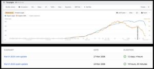
Google moved from rewarding volume to rewarding information gain — how much genuinely new stuff you put into the index that wasn’t there before. Topical authority now gets credited for added value, not coverage. A cluster with no new data, no fresh case, no original connection between things gets its authority capped at roughly zero. And a blog full of rehashed AI articles cranked out “for topical authority” reads as low-effort and pulls down the rankings of your actual money pages, because Google scores the domain as one object now.
This is the part people miss: the damage doesn’t stay on the thin pages. When a core or spam update lands — and one rolls out roughly every quarter — Google recalculates the quality of the whole domain and pushes sites like this down as a unit. It’s not that your weak blog posts stop ranking. It’s that they drag your service pages, your homepage, the URLs that actually make you money, down with them. I’ve stared at the chart where page count climbs and organic traffic falls off a ledge in the same frame, right on an update date — articles written to close topical authority doing the exact opposite.
The “just rank top 10” goal is fading too. In AI Overviews, only about 38% of citations now come from pages in the top ten — the rest get pulled from deeper in the index, picked for being source-worthy rather than well-positioned. A year ago that number was 76%. Ranking #1 no longer buys you a seat in the answer. Being a primary source does.
So the blog plan I actually hand clients during a redesign:
Don’t write to match the top ten. Write what isn’t there. One article with a real insight, a real case, or data nobody else has will out-earn a hundred pages of AI filler. Google indexes usefulness now, not rewrites.
Ship 5–10 pieces built on real experience. Not for volume — for proof. In B2B the blog is where a buyer decides whether you actually know the work and can be trusted with it. Real cases, real screenshots, real numbers, a named author with a footprint you can verify. This is where E-E-A-T stops being a buzzword and becomes a technical requirement: describe a case study with nothing online to back it — no author trail, no documents, no mentions — and Google’s grounding checks treat it as unverified and dock your trust score. An invented case helps nobody.
And it pays off faster than people expect. I’ve had a site under a month old, with an article that didn’t even aim straight at the keyword, show up in rankings on information gain and a clean, trustworthy build alone. That doesn’t happen with rewrites. It happens when the page brings something the index didn’t already own.
Redesign a B2B site in 2026 without treating AI discovery as a first-class requirement and you’re optimizing for a search world that’s already half gone. Around 94% of B2B buyers now use AI search somewhere in the buying process. A Head of IT asks ChatGPT for the best security platforms for a 500-person SaaS company; a VP of Marketing asks Claude which CDPs suit a PLG motion — your company is in that answer or it isn’t, and most vendors have no idea which.
The relief, and I’ll keep it short because I detailed it in the build guide: there’s no dark art here. The same fundamentals carry it — original content, a crawlable and well-structured site, the actual answer to the page’s core question near the top, structured data, and a verifiable author footprint so the entity is trusted. One number worth holding onto: AI search referrals currently convert about 22% higher than traditional organic, because the assistant already pre-qualified the person before they arrived. Small channel today, real one tomorrow. Build for it now, while building for it is cheap.
I’ll close on the section no agency wants to write, which is exactly why it earns the most trust.
SEO and a serious conversion-focused redesign stopped being “affordable marketing.” They’re expensive now, complicated, and genuinely high-risk. CTR keeps sliding as AI answers swallow the informational clicks, core updates reshuffle the board every quarter, and the channel simply isn’t profitable for every business. For some companies the most honest, most valuable thing I can say is: don’t do this yet. Keep your money.
So run the numbers before you commit. What’s a closed deal worth to you? How many qualified leads would a redesign realistically add? What’s the all-in cost — including the months of monitoring and iteration after launch, not just the build? If the unit economics don’t close, if the top of the funnel can’t justify the spend at the bottom, then no amount of beautiful design or clever SEO changes the answer, and whoever’s promising you easy traffic is selling you something.
When the math does close, the 2026 playbook is narrow and clear. Human-plus-AI, with the expertise and the editing kept human. Information gain over volume. A real digital footprint for your authors. A few expensive links with actual traffic instead of link farms. A site engineered for your specific buyer and the conversion, not for “looks nice.” The era of clever spam is done — fooling Google costs more now than just doing the work. What survives is the stuff you can’t fake: real expertise, original data, real tests, real reputation. Quality stopped being a luxury for white-hat niches. It’s the only strategy left that still works.