Real estate costs a lot, that is why buyers expect to receive high-standard service in every aspect.
Most real estate websites don’t fail because they look bad.
| Website issue | Why it costs you clients | How to fix it |
|---|---|---|
| Filter URLs Google can’t read | Pages that match real searches stay invisible | Clean, keyword-readable URLs for every meaningful filter |
| No unique meta tags / duplicate text | Keyword cannibalization — Google ranks none of the pages well | Unique title, H1 and copy on every filter and listing page |
| No internal links to deep pages | Strong pages are never discovered | Tag system linking out to narrower, lower-competition pages |
| Template-based build | No URL control, bloated code, slow Core Web Vitals | Custom development — control over structure, code and speed |
| Desktop squished onto mobile | Most searches are mobile; the experience breaks | A mobile layout designed on purpose, not auto-collapsed |
| Outdated design | Trust drops in the first seconds, before a word is read | A clean, current design built around the buyer |
| Built for “everyone” | Speaks clearly to no one | Design around the specific buyer you actually want |
| Weak CTAs / hidden contacts | Traffic arrives but never converts | Tap-to-call, per-listing forms, clear “book a viewing” |
| Broken / bolted-on IDX | Duplicate content and crawl bloat | Unique area pages linking into light IDX results |
They fail because of a handful of specific, fixable problems — and almost all of them trace back to one thing.
Hi, my name is Roman Makuev, I’m the SEO Team Lead at Neon Team and the creator of seo-algorithm.com, a professional SEO toolkit. I’ve spent a lot of time looking at why real estate websites underperform in search — and in this article I want to walk through the issues I see most often, and what we do differently when we build these sites ourselves.
Somewhere between 180,000 and 250,000 new websites go live every day (source: Netcraft, Forbes, DemandSage). Most of them are noise, and both people and Google have gotten very good at scrolling past noise. If you’re a real estate agent, you almost certainly have a website. The real question is whether it brings you clients — or just sits there like a digital business card.
Here’s the pattern I want you to notice as we go: most of these problems exist because design and SEO were treated as two separate jobs, handed to two people who never spoke to each other. Let me show you what that looks like in practice.
This is the big one, and almost nobody talks about it.
A real estate site lives or dies by its filters — by area, by property type, by price, by sale or rental. On most sites, when a visitor clicks a filter, the page it produces has a URL like this:
site.com/property/for-sale/villa?currency=IDR&filter[0]=3
A string of parameters. No readable words, no keyword. Google looks at that and either ignores it or indexes it poorly — so for search purposes, the page barely exists.
Now consider what that costs. Every one of those filter combinations matches something a buyer is actually typing into Google: “villas for sale in [area],” “land for sale [district].” Each one could be a page that ranks. Instead it’s invisible.
When we built the website for Horizon Estate, a Bali real estate agency, this was the first thing we designed around. Every meaningful filter became its own real page with a clean, readable URL:
horizonestatebali.com/buy/type-villas/tag-luxury/
The change sounds cosmetic until you look at the results: that URL is a page Google can actually read, index and rank for the exact search a buyer types in. On the Horizon Estate project, mapping real search demand to filter combinations — property types, districts, bedroom counts, tags — produced around 450 of these pages. Nothing speculative: every one of them matched a phrase real people were searching for.

Let’s say your filter pages are reachable. The next problem I almost always find: they’re empty shells.
No unique title tag. No unique H1. No meta description. And very often, the same paragraph of text copy-pasted at the bottom of dozens of category pages. Google sees twenty near-identical pages and can’t tell which one deserves to rank — so it ranks none of them well. That’s keyword cannibalization, and real estate sites are full of it.
On the Horizon Estate project we gave every filter page its own title with its own keyword, its own H1, and genuinely unique copy describing that specific area or property type. It takes more work upfront — and it’s exactly this work that separates filter pages that rank from filter pages that merely exist in the index.
None of it works, though, unless you know which queries buyers actually type — and in real estate that’s less obvious than it looks. To give one example from the Bali project: “bali real estate” pulls roughly the same 1,300 monthly searches whether the buyer sits in Indonesia, the US or Australia, but the keyword difficulty swings from 46 to 61 depending on the country, because you’re competing against a different set of sites in each market. Same phrase, three different fights. I broke down the full workflow — collecting, clustering and mapping keywords to pages — in a separate article on how to collect keywords for a real estate website.
You can build great filter pages and still have Google never discover them — simply because nothing on the site points to them.
The fix is internal linking, and specifically a tag system. From your main sections you link out to narrower, lower-competition pages: not just “villas,” but “ocean view villas” – horizonestatebali.com/buy/type-villas/tag-luxury/.
On the Bali site we built tags exactly for this:
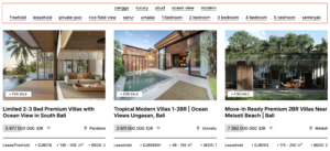
Each tag is another door into the site from search — another page targeting a lower-competition keyword that’s easier to rank for. Done properly, one real estate website ends up with dozens of entry points instead of one or two.
We also built video into these pages. A property page with two photos and a line of text is a thin page — Google can tell, and so can a buyer who can’t fly out to view the property yet. Video gives Google a richer, more relevant page, and it gives the buyer a reason to trust what they’re seeing
Here’s something worth sitting with. AI design tools learn from the average of everything already online. The more sites built that way, the more they converge — same grids, same gradients, same fonts, same hero section. The result is what I’d call template blindness: people have seen the layout so many times their eyes slide right off it. The site doesn’t look bad. It looks like nothing.
There’s a direct SEO cost too. A template hands you a fixed structure — which is often the exact reason the filter URLs in problem #1 are broken: you simply don’t control them. Templates also tend to ship with heavy, bloated code, and that slows the site down. Page speed is something Google measures directly through Core Web Vitals, and a slow site bleeds rankings and visitors at the same time. Custom development gives you back control of the URL structure, the code and the speed — which is why we don’t build these sites on templates.
Most property searches happen on a phone, so this one costs real money.
With a template, the “mobile version” is usually the desktop layout collapsed automatically — three columns stacking into one, text reflowing wherever it lands. Nobody designed that layout for a phone. It just happens to fit on the screen.
A proper mobile version is designed by a designer, deliberately, around how someone actually uses a property site one-handed on a small screen.
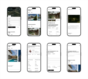
That’s a different layout, built on purpose — not the desktop folded up.
When someone is about to spend six or seven figures, everything downstream — the call, the viewing, the deal — depends on whether the site earns their trust in the first few seconds.
The research here is old but remarkably consistent. In a well-known British study of health websites, 94% of the reasons people gave for distrusting a site were about its design rather than its content. The Stanford Web Credibility Project found that roughly three quarters of users admit to judging a company’s credibility by how its website looks. And that judgment forms fast — in lab studies, people rate a page’s visual appeal in a fraction of a second, long before they’ve read a line about your listings.
There’s a psychological layer underneath it. A clean, calm interface reads as competence and reliability. A cluttered one creates low-level stress, and people leave to escape that feeling without ever knowing why they did. For a higher-end audience — and real estate buyers often are exactly that — the effect is even sharper: a refined, minimal site signals status and seriousness, while an overloaded one can read as cheap, or even as a scam.
A site built for everyone speaks clearly to no one.
The investor chasing rental yield, the family relocating, the younger first-time buyer — they don’t want the same things, don’t decide the same way, and don’t respond to the same design. A premium audience responds to space, restraint and a sense of story. A more price-driven audience wants visible proof, clear benefits and density of information — too much white space can read to them as unfinished.
You don’t need five websites. You do need to design yours around the specific buyer you actually want — their budget, their worries, the way they make decisions — instead of an imaginary average visitor.
This one is the easiest to miss. The site gets visitors, the rankings even improve, and still the phone doesn’t ring. Usually it’s because nobody designed the next step.
The same mistakes come up again and again: the phone number sits in the footer instead of the header, there’s no tap-to-call on mobile, the only contact form is buried on a separate “Contact” page, and a listing a buyer likes has no obvious way to ask about it. The visitor was interested — and the site gave them nothing to do with that interest.
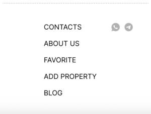
The fix starts with a question most sites skip: how does your buyer actually prefer to get in touch? On Horizon Estate the buyers are international — they sit in Australia, the US or Europe, and almost none of them will dial an Indonesian phone number. They message. So we put WhatsApp and Telegram straight into the top menu, one tap away from any page on the site:
And instead of an anonymous “contact us” form, every listing (and the homepage) carries a contact block with a real person — photo, name, role, direct number and messenger links:
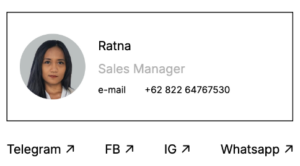
That block does two jobs at once. It removes friction — the buyer reaches a human in their own channel in one tap. And it builds trust: a named person with a face next to the property tells the buyer exactly who will answer, which matters when the inquiry is about a six-figure purchase in another country.
Your channels may differ — for a local US audience, tap-to-call and a “book a viewing” button will do more work than Telegram. The principle doesn’t change: traffic is only half the job. The other half is making the next step obvious, in whatever channel your buyer actually uses.
If you work with an MLS, IDX is usually the first place SEO breaks — and it deserves its own section because the architecture is different from everything above. Our own projects, like Horizon Estate, run in markets without an MLS, where every listing is the site’s own content; but the IDX failure modes are well documented across US agent sites, and they follow directly from the logic of this article.
Two problems dominate. The first is duplicate content: the IDX feed drops the same MLS description onto every agent’s site, so your listing pages look identical to a thousand others, and Google has no reason to rank yours. The second is crawl bloat — IDX generates endless near-identical URLs (every filter, every sort order, every map state), and Google wastes its time crawling variations instead of the pages that matter.
If that sounds familiar, it should: these are problems #1 and #2 from the top of this article all over again — unreadable parameter URLs and duplicated pages. With one crucial difference: this time you can’t fix the pages themselves, because the listing content comes from the feed and looks the same everywhere.
So the division of labor changes. On a custom site, every filter page can be made unique and sent out to rank. With IDX, the pages that can be unique are your area and neighborhood pages — written by you — and they become the SEO entry points, linking through to the IDX search results for their area. The IDX side, which can’t be unique, should stay out of Google’s way: keep the parameter variations out of the index (canonicals, noindex on sort and map states), keep the IDX templates light, and don’t let thin duplicated listing pages become the face of your site in search. IDX should keep visitors searching on your site longer. Used carelessly, it does the opposite.
Look back at that list. Broken filter URLs, missing meta tags, no internal linking, template limitations, bad mobile, weak trust, no segmentation. Nine items — and underneath them, I keep finding the same single root cause.
Each of them comes from treating design, SEO and the psychology of the buyer as three separate projects. An agency builds something pretty. An SEO contractor is brought in afterwards and has to fight the structure. Nobody designed the site around the person actually buying a property.
The old approach was: make it clean, make it look good. The approach I’d argue for is different: make it so the right person, at the right moment, immediately understands what’s here and does the thing you need them to do. A real estate website should be built on its SEO structure from day one — not have SEO bolted on once the design is finished.
That’s how we approached the Horizon Estate project — design, development and SEO built together, as one process. You can see the full case study here.



